Matlab colormaps are usefull to display continuous spatial information. More about colormap usage and options can be found under Matlab help file https://www.mathworks.com/help/matlab/ref/colormap.html.
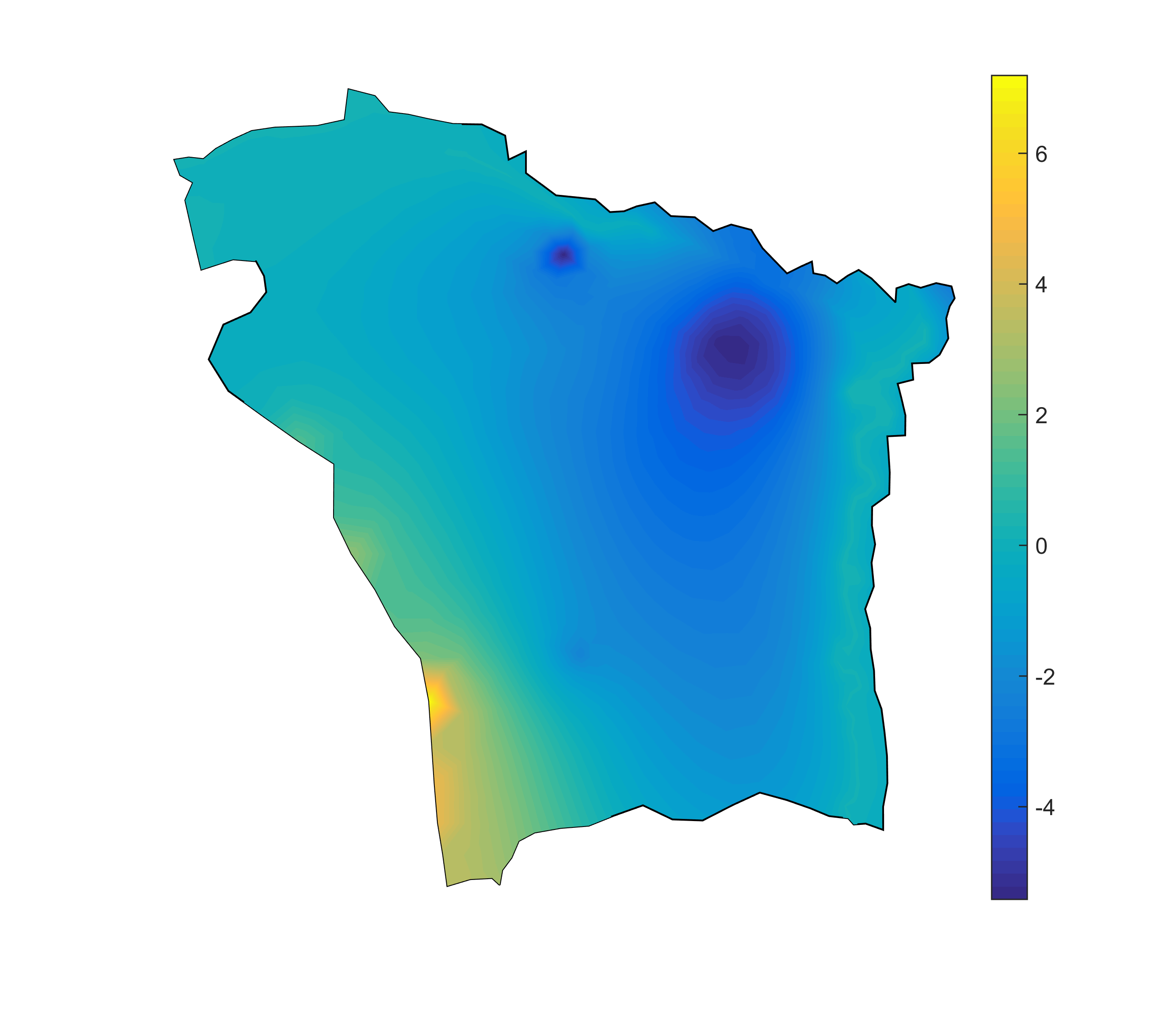
However there are cases where the default colormaps are not sufficient. For example the figure below shows the hydraulic head trend over an 80-year simulation. For the areas with positive values the groundwater table is rising while in the areas with negative values the water table drops. However using the default colormap is not easy to distinguish these areas.
|
1 2 3 4 5 6 7 8 9 |
clf hold on plot(study_area.X,study_area.Y,'k', 'LineWidth', 2) trisurf(TR,p(:,1), p(:,2), baseslopedecade,'edgecolor','none',... 'FaceColor','interp','FaceLighting','phong'); colorbar axis equal axis off hold off |
To improve the figure we are going to modify the colormap so that the color at value 0 is white, while the positive values will have a blue gradient from deep blue to white, and the negative values a gradient from white to deep red.
After we have plotted the figure we can obtain information about the color axis as follows
|
1 2 |
ax = gca; [cmin cmax] = caxis; |
In my example cmax = 7.2 and cmin = -5.4. We can also set our own custom limits for the colors by setting ax.CLim = [-5 8]; . This will make the cmin = -5 and cmax = 8. This is very useful if one wants consistent colormaps between different figures with different range values.
Next we’ll create a variable that has values that range between cmin and cmax and identify the last row that is negative. In my case that was the 28th row (id = 28).
|
1 2 |
lcol = linspace(cmin,cmax,64)'; id = find(lcol > 0,1)-1; |
Next, for each row of the variable lcol we have to assign a color. The lcol(1) corresponds to cmin therefore we want to assign deep red (130,0,0) while the row id corresponds to 0 values which should have white color (255, 255, 255). The last row corresponds to cmax and we will assign deep blue (0, 0, 130). For the remaining row we will interpolate their values as follows:
|
1 2 |
custom_map = [linspace(130/255, 1, id)' linspace(0, 1, id)' linspace(0, 1, id)'; ... linspace(1,0,64-id)' linspace(1,0,64-id)' linspace(1,130/255,64-id)']; |
custom_map is a 64×3 matrix. The columns correspond to the R, G and B normalized color values.
Next we set our custom map to be our colormap
|
1 |
colormap(custom_map); |
Finally we display it and assign an explanatory text
|
1 2 |
h = colorbar; h.Label.String = 'Drawdown [ft/decade]'; |

In the above map we can easily distinguish between the areas where the water table rises or drops.
The full code for the above figure is given below with a minor change that controls the color resolution:
|
1 2 3 4 5 6 7 8 9 10 11 12 13 14 15 16 17 18 19 |
clf plot(study_area.X,study_area.Y,'k', 'LineWidth', 1) hold on trisurf(TR,p(:,1),p(:,2),baseslopedecade,'edgecolor','none',... 'FaceColor','interp','FaceLighting','phong'); ax = gca; [cmin cmax] = caxis; color_res = 512; %Color resolution lcol = linspace(cmin,cmax,color_res)'; id = find(lcol > 0,1)-1; custom_map = [linspace(130/255, 1, id)' linspace(0, 1, id)' linspace(0, 1, id)'; ... linspace(1,0,color_res-id)' linspace(1,0,color_res-id)' linspace(1,130/255,color_res-id)']; colormap(custom_map); h = colorbar; h.Label.String = 'Drawdown [ft/decade]'; view(0,90); axis equal axis off hold off |